How to use the article A, An, The
click to enlarge
click to enlarge

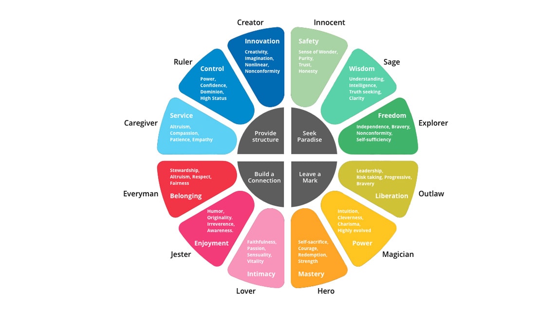
The wheel displays characteristics and traits and show how they relate to different ones. Source: Map & Fire (https://mapandfire.com)
Color is everywhere. One could say, that color is life. The psychology of color and what they mean is something many people have not even thought about it.
To see color, you have to have light. When light shines on an object some colors bounce off the object and others are absorbed by it. Our eyes only see the colors that are bounced off or reflected. The sun’s rays contain all the colors of the rainbow mixed together. This mix is known as white light.
Each color has a different wavelength. Red has the longest wavelength. Violet has the shortest. While artists consider black a color, scientists do not because black is the absence of all color.
Have you ever thought how color relates to a brand? You can think about colors that actually have a patent and are easily identifiable. For instance, Coca-Cola red is not any red, it is specific to the brand. Take a look at what the archetype wheel, you can see how red embodies “Build a Connection,” and that is exactly one of the main aims of the Brand.
Check out how the full article on Why your brand needs to identify a brand character.
Source: https://www.adweek.com/brand-
Just Sit Down and Relax is a compilation of photographs taken in some European cities, including Madrid, Cuenca, and Lisbon, during the course of 2010. It aims to indicate the rhythms of these cities. Walking by its cobbled streets, under the shades, and colors that allow us to savor its history through its brushstrokes in its particular urban landscape. This is how urban rhythms are intertwined. It is fascinating to observe them from their terraces accompanied by a cup of coffee.
The expressionist portrait shown in this book interpolates women and men with the urban landscape. A personal vision of the intrinsic relationship that exists between both.
An eternal delight in the fashion shows of New York, now the simple curiosity of watching the Fashion Week of Cibeles in Madrid. Photos taken at the show by Sita Murt consecrated Spanish designer, who recently opened doors in Paris, in front of the Picasso museum. His color palette of this Spring 2011 collection, evokes personally, the softest tones of Europe.
The abstract landscape pretends to imitate oil painting in a subjective way by means of photography. Using the camera as an instrument of expression showing the unlimited ways of observing and capturing nature. The application of vaseline on the filter, the movements
speculations, long exposures, are some of the techniques used to achieve this series, internal walk.
From 2008 to 2014, the design studio was in charge of designing, modernizing and updating everything related to the image for the public. Four years of preparing all collateral material and templates for the client to be completely autonomous when undertaking new projects.
Some projects:
Each year, all the collateral material, printed and online, was designed to promote the golf course.
Example of Summer League Brochure.